그래프 그리기
1
2
3
4
5
6
7
8
9
10
11
12
13
14
15
16
17
18
19
20
21
22
23
24
25
26
dataset_1 = anscombe[anscombe['dataset'] == 'I']
dataset_2 = anscombe[anscombe['dataset'] == 'II']
dataset_3 = anscombe[anscombe['dataset'] == 'III']
dataset_4 = anscombe[anscombe['dataset'] == 'IV']

# 그래프 격자가 위치할 기본 틀
fig = plt.figure()
fig.suptitle("anscombe data")
fig.tight_layout()

axes1 = fig.add_subplot(2, 2, 1)
axes2 = fig.add_subplot(2, 2, 2)
axes3 = fig.add_subplot(2, 2, 3)
axes4 = fig.add_subplot(2, 2, 4)

axes1.plot(dataset_1['x'], dataset_1['y'], 'o')
axes2.plot(dataset_2['x'], dataset_2['y'], 'o')
axes3.plot(dataset_3['x'], dataset_3['y'], 'o')
axes4.plot(dataset_4['x'], dataset_4['y'], 'o')

axes1.set_title('dataset_1')
axes2.set_title('dataset_2')
axes3.set_title('dataset_3')
axes4.set_title('dataset_4')

plt.show()
figure()로 그래프 격자가 위치할 틀을 만들어 준다add_subplot으로 각 그래프의 위치를 지정해 준다set_title로 각 그래프의 제목을 지정해 줄 수 있다
matplotlib 자유자재로 사용하기
1
2
3
4
5
6
7
8
9
10
11
12
13
14
15
16
17
def recode_sex(sex):
if sex == "Female":
return 0
else:
return 1
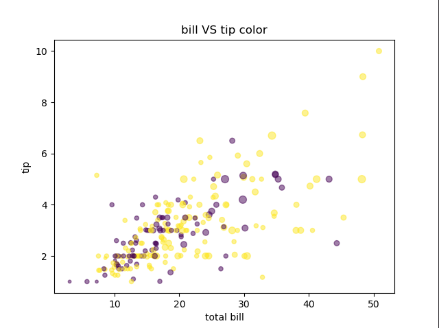
tips['sex_color'] = tips['sex'].apply(recode_sex)
axes1.scatter(
x=tips['total_bill'],
y=tips['tip'],
s=tips['size'] * 10,
c=tips['sex_color'],
alpha=0.5)
axes1.set_title('bill VS tip color')
axes1.set_xlabel('total bill')
axes1.set_ylabel('tip')
scatter()의 인자 중s는 점의 크기이고,c는 점의 색을 의미한다alpha인값으로 점의 투명도를 조절한다
seaborn 자유자재로 사용하기
1
2
3
4
5
tips = sns.load_dataset("tips")

ax = plt.subplots()
ax = sns.distplot(tips['total_bill'], rug=True)
ax.set_title('total bill')
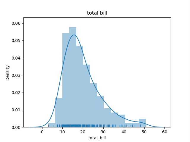
distplot()에rug=True인를 주면 그래프 아래에 양탄자 그래프가 그려진다hist=인자와kde=인자는 각각 히스토그램과 밀집도 그래프의 유무를 정해준다
1
2
ax = sns.countplot('day', data=tips)
ax.set_title('count')
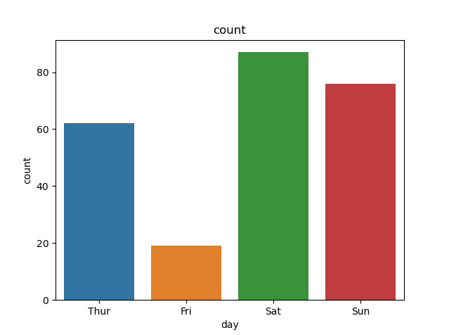
countplot그래프이다
1
2
ax = sns.regplot(x='total_bill', y='tip', data=tips)
ax.set_title('scatter')
regplot()은 산점도 그래프와 회귀선을 함께 그릴 수 있다- 회귀선을 제거하려면
fit_reg=인값을 False로 지정하면 된다
1
2
3
joint = sns.jointplot(x='total_bill', y='tip', data=tips)
joint.set_axis_labels(xlabel='total bill', ylabel='tip')
joint.fig.suptitle('joint', fontsize=10, y=1.03)
jointplot의kind=인에 ‘hex’를 넣어주면 육각형으로 데이터를 볼 수 있다
이차원 밀집도 그리기
1
2
3
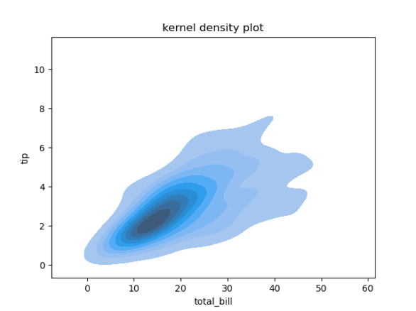
ax = sns.kdeplot(data=tips['total_bill'],
data2=tips['tip'],
shade=True)
shade인값을 True로 지정하면 그래프에 음영 효과를 줄 수 있다![pic.png]()
1
2
3
4
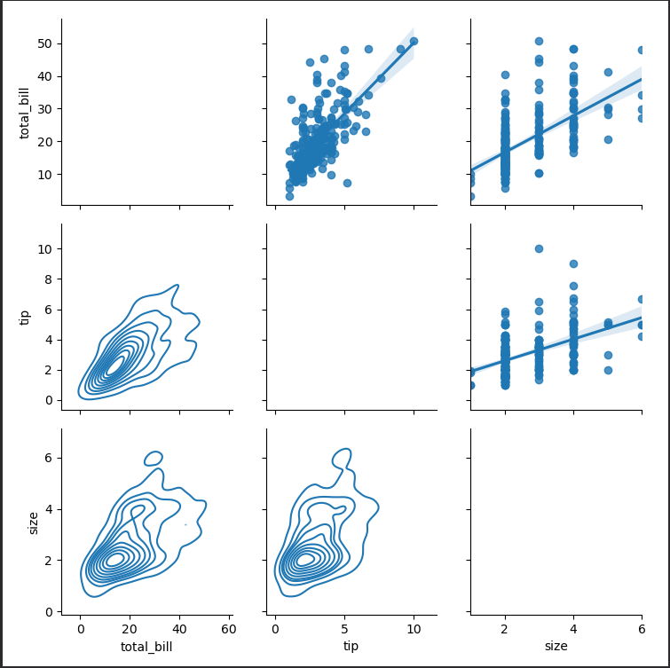
pair_grid = sns.PairGrid(tips)
pair_grid = pair_grid.map_upper(sns.regplot)
pair_grid = pair_grid.map_lower(sns.kdeplot)
pair_grid = pair_grid.map_diag(sns.distplot, rug=True)
pair_grid에 원하는 그래프를 지정해서 그릴 수 있다
데이터프레임과 시리즈로 그래프 그리기
- 밀집도, 산점도 그래프, 육각 그래프는 각각 kde, scatter, hexbin 메서드를 사용하여 그릴 수 있다
seaborn 라이브러리로 그래프 스타일 설정하기
1
2
3
sns.set_style('whitegrid')
fig, ax = plt.subplots()
ax = sns.violinplot(x='time', y='total_bill', hue='sex', data=tips, split=True)
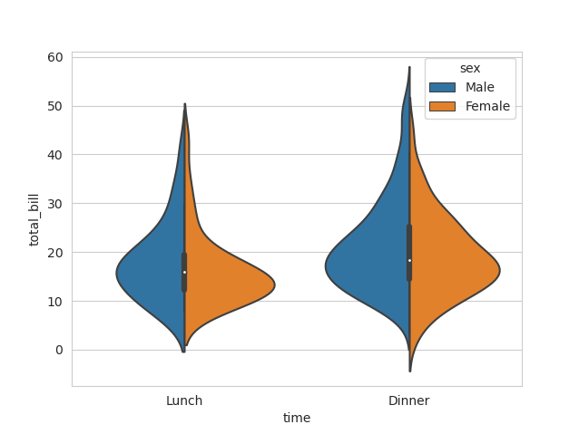
whitegrid로 스타일을 설정하여 그래프를 그리면 가로줄이 생긴다
1
2
3
4
5
6
7
8
9
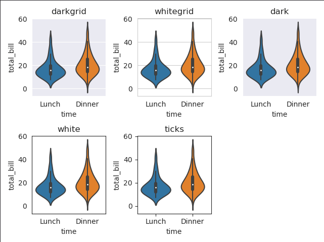
fig = plt.figure()
seaborn_style = ['darkgrid', 'whitegrid', 'dark', 'white', 'ticks']
for idx, style in enumerate(seaborn_style):
plot_position = idx + 1
with sns.axes_style(style):
ax = fig.add_subplot(2, 3, plot_position)
violin = sns.violinplot(x='time', y='total_bill', data=tips, ax=ax)
violin.set_title(style)
fig.tight_layout()